Music Video A2
Thursday, 15 March 2012
Wednesday, 14 March 2012
Evaluation Question 3 What have you learnt from your audience feedback?
From our feedback we have found that overall our music video was a success. We established this from our the questions that we asked our target audience as we asked them to give a rating of 1 to 10 and 10 be the highest indicating if they liked our video. We scored consistent high level ratings. The feedback was great as people said that they enjoyed the video as a whole especially the effects and they did not find themselves disengaging from our project while they were watching it. However there were cons to our pros as some said that they found that though our effects were great that we used too many effects and not enough of other settings, also that one of the backgrounds we put in the video using the blue screen did not quite fit in with the rest of the music video. We were also told that we should have used more people in our music video instead of having the main protagonist by herself, though they did think that she did well.
Question 2) How effective is the combination of your main product and ancillary texts?
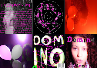
This is the digipak I created using the program Photoshop. The whole design and style of the digipak was made in mind of the genre of music we were doing, the song itself, the type of artist we want to portray and also the original artist and their conventions. Hence the use of the bright colours such as the fluorescent pink. I carefully selected images of the artist in their happiest state and having fun. This was done to match the sing we were doing as it is a happy, fast paced, good feeling song and we wanted it to be shown through the digipak and not only the music video. This was also done to attract our target audience of the young, outgoing, adventures generation. An idea both my partner and I came up with was to use pictures from the video and apply them to the digipak so they could work together well as there would be a connection and a form of recognition for the images used and a familiarity for those who wish to buy the product. The music video combined with the digipak are effective as they carry the same style an images which compliment one another. When these are linked with the magazine advert we decided to take another route by not using as many colours in the advert as we did not want to overload and become repetitive. I believe that the magazine advert balances out when put with the other texts as it ads a sense of calm and sophistication which is needed. Overall I believe that our main product and ancillary texts all are very effective individually when they stand by themselves and together when they are all used together. (For more feedback video responses from question 4 can be viewed).

Tuesday, 13 March 2012
Sunday, 11 March 2012
Friday, 9 March 2012
Filming Schedule
Day | Time | Process |
Monday 16th | 1:15pm | Filming our opening scene on the bus we hired. |
Tuesday 17th | 8:50am | Filming in the studio |
Friday 20th | 1:15pm | Filming around south Norwood |
Monday 23rd | 1:15pm | Filming and taking photos for music video and digipak |
Editing our photos for magazine advert using photoshop
These are a couple of images of the editing of the images that we did on Photoshop of our main character of the music video which we used for one of our magazine covers. We were going to use the same image for our digipak but decided against it as we did not want to keep on reusing the same image over and over again. Also we wanted to stay in the style of Jessie J who is continually keeping her image fresh and interesting.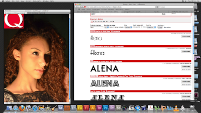

In the first image presented we edited in longer false eyelashes to bring out her eyes more and give the image a more prominent feeling and effect and to help the whole image and layout of the cover would look as professional as possible.

In the image above we did not need to do anything with the lighting as when we took the image we had already adjusted the lighting to complement her features in the bes possible way, as you can see that it gives a nice glow to her skin tone and highlights her hair by giving it a richer and lighter colour.
To the right of the image you are able to see a variety of different fonts spelling out our lead singers name (the fonts were provided by www.dafont.com) we are planing on choosing the second one down as we wanted the writing to have the effect of a neon light.
Screenshots
Here are a couple of screen shots of the didgipak that I am making on Photoshop. As you can see I have nearly finished, it all that is left to do is put the HMV logo on the same pannel as the barcode and thankyou page on the top left hand pannel.
Thursday, 8 March 2012
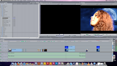
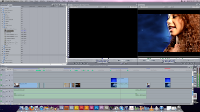
Editing in studio scenes and putting green screen effect on using Final Cut Pro software
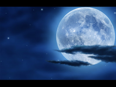
We selecte a backdrop of the moon that we are going to put into the music video. Here are some scrren shots of the backdrop being edited into the music video and also what it looks like after it has been done.


Inspiration for our own video
We took inspiration from the video "Gonna Get Over You" by Sarah Barellies as it followed the same conversions that we were looking to use in our own music video for example the spontaneous dancing and the whole imagination/dream aspect of the video. An idea we liked a lot was the use of the confetti cannons at the end so we have decided to use that in our own music video.
This second video by Chris Brown has a scene where he's singing as glitter is falling around him which gave us the idea to have a similar, effective and beautiful style to it with our own twist put on it.
The backdrop we intend to use for our music video
We intend to have a backdrop image for the filming we are going to do in the studio and we thought we would use a moonlight image as in the song the lyrics "moonlight" is used repeatedly so we thought it would be a great idea to use a image that incorporates and matches the lyrics presented in the song.


My partner and I searching for the ideal image.
This is the image for the backdrop that will be edited onto the blue screen and finally into our video.
Filming last scenes in the studio (then we found that we were unable to use the footage)
Here are some clips from the filming that was done. The problem identified is clearly visible.
Tuesday, 6 March 2012
Diary Entry
Tuesday 29th November 2011
Today we presented out proposal to our class and got a few feedbacks to help improve our idea for our music video. Once we had presented we were told that we might find it difficult to shoot some of our clips on the bus so we decided to use a empty bus which wasn't running so that it'll be easier for the dancers to dance and also for the camera to stay still other wise our if we were on a moving bus then the camera will start shaking.
Another feedback that was given was about our costumes. At first we had the idea of just getting our singer to wear something of her own clothes but then we changed our mind to designing our own clothes for the singer which has the same conventions of Jessie J's style of clothing but our own designs.
Some of our shots for the music video was planned to be shot at night but we were told that it was a bad idea as the shots will come out too dark so we decided to use the green screen in the studio and create moonlight background to match some of the words from the lyrics in the song.
We also decided to use some effects on the music video such as words from the song popping up when its sung like Kanye Wests music video Gold digger.
Our Survey
We had the issue of deciding between the song Smooches by Kelly Rowland and Jessie J's song Domino which do not have music videos so we decided to distribute a survey and asked the youth and our target audience which song they prefer the most.
These are the questions we asked:
1. Which song has a better beat?
2. Which song would have a better dance routine?
3. Which song will make a better music video?
4. Which song?
These are the questions we asked:
1. Which song has a better beat?
2. Which song would have a better dance routine?
3. Which song will make a better music video?
4. Which song?
Thursday, 26 January 2012
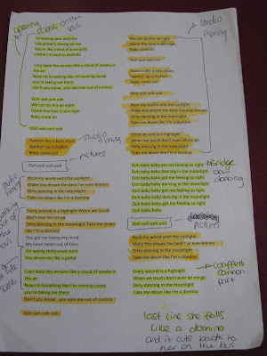
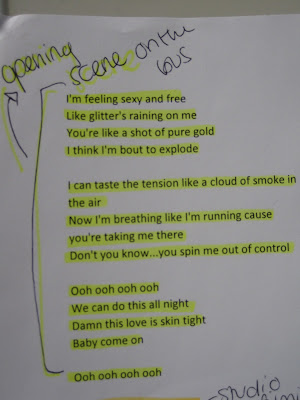
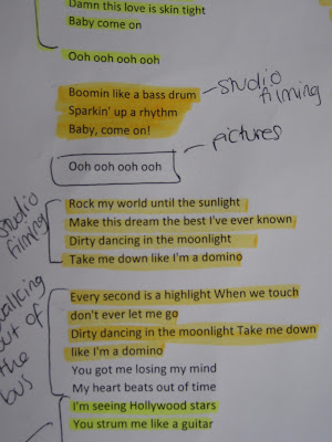
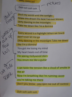
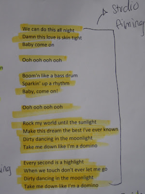
The lyrics sheet
This is the sheet we annotated outlining what we want to do for each section of the song.


Wednesday, 25 January 2012
Sunday, 15 January 2012
Cast & Crew
'Domino' lyrics
I'm feeling sexy and free
Like glitter's raining on me
You're like a shot of pure gold
I think I'm 'bout to explode
I can taste the tension like a cloud of smoke in the air
Now I'm breathing like I'm running cause you're taking me there
Don't you know...you spin me out of control
Ooh ooh ooh ooh
We can do this all night
Damn this love's skin tight
Baby come on
Ooh ooh ooh ooh
Pull me like a bass drum
Sparkin' up a rhythm
Baby, come on!
Ooh ooh ooh ooh
Rock my world into the sunlight
Make this dream the best I've ever known
Dirty dancing in the moonlight
Take me down like I'm a domino
Every second is a highlight
When we touch don't ever let me go
Dirty dancing in the moonlight
Take me down like I'm a domino
You got me losing my mind
My heart beats out of time
I'm seeing Hollywood stars
You strum me like a guitar
I can taste the tension like a cloud of smoke in the air
Now I'm breathing like I'm running cause you're taking me there
Don't you know...you spin me out of control
Ooh ooh ooh ooh
We can do this all night
Damn this love's skin tight
Baby come on
Ooh ooh ooh ooh
Pull me like a bass drum
Sparkin' up a rhythm
Baby, come on!
Ooh ooh ooh ooh
Rock my world into the sunlight
Make this dream the best I've ever known
Dirty dancing in the moonlight
Take me down like I'm a domino
Every second is a highlight
When we touch don't ever let me go
Dirty dancing in the moonlight
Take me down like I'm a domino
Ooh baby baby got me feeling so right
Ooh baby baby dancing in the moonlight
Ooh baby baby got me feeling so right
Ooh baby baby dancing in the moonlight
Ooh baby baby got me feeling so right
Ooh baby baby dancing in the moonlight
Rock my world into the sunlight
Make this dream the best I've ever known
Dirty dancing in the moonlight
Take me down like I'm a domino
Every second is a highlight
When we touch don't ever let me go
Dirty dancing in the moonlight
Take me down like I'm a domino
Tuesday, 10 January 2012
Reckie
A reckie is when you take a look at different potential areas and sites for filming. It helps to know what the lighting would look like at in various locations and times along with the sound quality; noise control and what equipment they'll need to bring and where the electrical outlets are.
This the reckie of the locations we have decided to use for our music video which are the studio at our college the bus we will use and outside.

This is the reckie for the studio which we will be using to shoot our photo shoot the bridge of our song. the noise level in the studio is an ideal level with no disruptions meaning no interruptions when filming. The lighting is low and can be adjusted to whatever we wish. Only a HD camera will be needed for this location as there are light located there already.


This is the reckie for the bus for our opening scene. for the bus scene we could not take a light because there were no outlets as well as it being a area to film in but we were using a HD camera which had high key lighting ab effect that naturally brightens not so well lit area/locations. this was a handy and a very effective thing to have to hand.

In this image you can see the effectiveness of the high key lighting effect. It has helped brighten the image unlike the images shown previously.The bus was in a scheduled area where Mayday bus services keep all their coaches so it helped to film as there were no noises or movements to distort or disrupt the filming of the music video.
Monday, 9 January 2012
Our magazine advert idea
We must create a magazine advert to accompany the music video. We decided to an advert in Q magazine so we drew up some potential ideas. We chose to have the advert covered with an image of our or main person from her waist and up while holding in her hands the letters that spell out the word and title of our chosen song "Domino".

Subscribe to:
Comments (Atom)


