Wednesday, 14 March 2012
Question 2) How effective is the combination of your main product and ancillary texts?
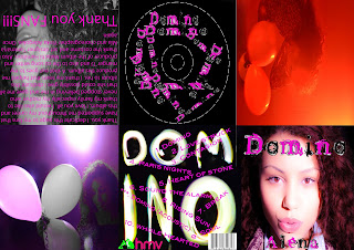
This is the digipak I created using the program Photoshop. The whole design and style of the digipak was made in mind of the genre of music we were doing, the song itself, the type of artist we want to portray and also the original artist and their conventions. Hence the use of the bright colours such as the fluorescent pink. I carefully selected images of the artist in their happiest state and having fun. This was done to match the sing we were doing as it is a happy, fast paced, good feeling song and we wanted it to be shown through the digipak and not only the music video. This was also done to attract our target audience of the young, outgoing, adventures generation. An idea both my partner and I came up with was to use pictures from the video and apply them to the digipak so they could work together well as there would be a connection and a form of recognition for the images used and a familiarity for those who wish to buy the product. The music video combined with the digipak are effective as they carry the same style an images which compliment one another. When these are linked with the magazine advert we decided to take another route by not using as many colours in the advert as we did not want to overload and become repetitive. I believe that the magazine advert balances out when put with the other texts as it ads a sense of calm and sophistication which is needed. Overall I believe that our main product and ancillary texts all are very effective individually when they stand by themselves and together when they are all used together. (For more feedback video responses from question 4 can be viewed).


Subscribe to:
Post Comments (Atom)

No comments:
Post a Comment