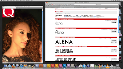
These are a couple of images of the editing of the images that we did on Photoshop of our main character of the music video which we used for one of our magazine covers. We were going to use the same image for our digipak but decided against it as we did not want to keep on reusing the same image over and over again. Also we wanted to stay in the style of Jessie J who is continually keeping her image fresh and interesting.

In the first image presented we edited in longer false eyelashes to bring out her eyes more and give the image a more prominent feeling and effect and to help the whole image and layout of the cover would look as professional as possible.

In the image above we did not need to do anything with the lighting as when we took the image we had already adjusted the lighting to complement her features in the bes possible way, as you can see that it gives a nice glow to her skin tone and highlights her hair by giving it a richer and lighter colour.
To the right of the image you are able to see a variety of different fonts spelling out our lead singers name (the fonts were provided by www.dafont.com) we are planing on choosing the second one down as we wanted the writing to have the effect of a neon light.
No comments:
Post a Comment